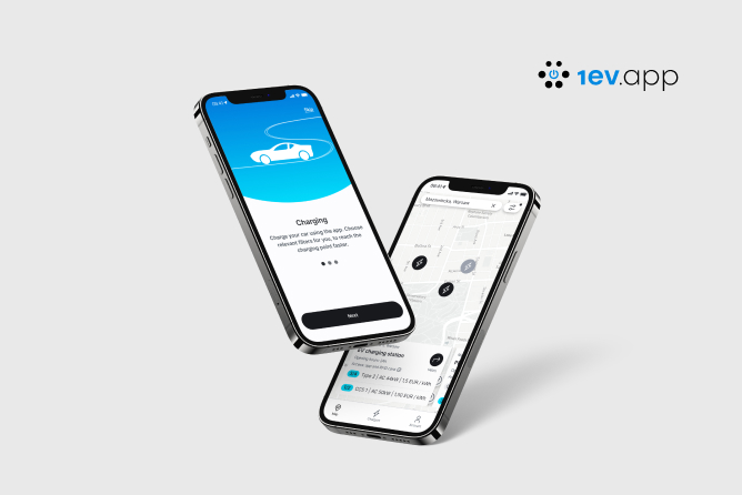
UX Design - What is it?
User Experience Design is designing user experiences, i.e. ensuring that the interaction with the product provides users with a positive experience. This term was first used by Don Norman, who while working at Apple Computers, gave himself the title of "User Experience Architect". Using an application or website should be enjoyable and satisfying enough to make the user want to use our product again and recommend it to others.
UX Design - as the name suggests, focuses on the user, because it is he who determines the success of our project. Today, users have high demands for digital products. If they encounter difficulties while using our product, there is a high probability that the average user will turn it off and never come back. That is why it is so important to include UX Design elements in the design process - minimizing the risk that the user will not find himself in our application and will go to the competition.
You will say - okay, but what do I have to do with this as a software developer? How can I use UX Design in my daily work?
Each of us has to deal with UX Design every day, but we don't know about it. This is best illustrated by an example: moving the kettle closer to the tea cabinet to make the preparation of the drink easier and faster. This is UX - adapting the "product" to the needs of the users who are ourselves.
UX Design - a guide for programmers
When working on a digital product, we should think about the people who will use the designed solution. It is not easy because when creating a new product, we can only guess who it will be and what their expectations are for what we create. However, there are a few points that we can pay attention to improve the UX of our product and learn good practices in the user experience design process.
1. Avoid incomprehensible messages
The user must feel confident when using our product. That is why it is important to design the texts in such a way that there is no doubt about how to use a given functionality. With each intricate message or unfortunate question, the user wastes time figuring out what to do. Besides, it also loses confidence in the app.

On the left, is an example of a bad message - the user may accidentally unsubscribe, thinking that Cancel will close the modal and not remove the subscription. On the right, revised version - now there is no doubt what each button is responsible for.
When dealing with the product we create, it is very easy to forget that the person using our product may not understand the displayed message. If the user does not know how to correct a mistake in the form or why he did not log in, there is a good chance that he will not want to use our application again.

The user does not understand the Specified date is incorrect especially since the date format appears to be correct. There is no information on what the error is. Changing the text to Date occurs in the past makes the user immediately know what to improve.
2. Intuitive buttons
Each button in the application should be designed in such a way that it is immediately obvious whether it can be clicked or not. While it is possible to change the cursor to the pointer on the desktop, it is not possible in mobile applications.

On the left design, the user may not be sure if Add to cart is clickable and may try to find another way to add a product to the cart. By changing the style of the button, there shouldn't be any doubts anymore.

The "back" button on the left design gives the impression of being turned off, impossible to click - gray is associated with disabled-buttons. A slight change of style and the design becomes easier to read immediately.
3. Simplify the design.
Design to make the application as easy as possible for the user to use. Remember that you are not designing for yourself, but for the user who will have contact with your product for the first time (and hopefully not the last time).

Replace select with radio buttons when there are few options to choose from (2-4) - because it is more convenient for the user. Besides, it allows you to make a decision faster when you know immediately what you have to choose.

Give up placeholders, because they are no longer useful when the user starts to write. Instead, add the information displayed under the input, which is available to the user all the time.
Unclear messages, poorly designed buttons, and complicated layouts are a great recipe for a product that no one will want to use. People are laughing at Web 1.0 sites because UX just doesn't exist there. It started to appear in Web 2.0 and is now becoming a standard in projects. Developers who omit UX in their projects will simply be left behind.
.jpg)


.jpg)


.jpg)

.jpg)


.jpg)
.jpg)

.jpg)
.jpg)

.jpg)

.jpg)
.jpg)
.jpg)

.jpg)
.webp)

.webp)


.jpg)


.webp)


.webp)


.webp)


.webp)


.webp)


.webp)


.webp)


